
Data visualisation is all the rage. Some day in the near future, we will be done with spending endless amounts of time producing static reports in Excel, PowerPoint, and Word, instead working with eye-candy dynamic reports such as those provided by Google Data Studio, Microsoft Power BI, Tableau, and many others. These platforms allow diverse data sources to be linked in near real-time to a single report or dashboard, from where users can interact with the data.
Date ranges and filters can be changed at will, saving the data analyst from constantly updating or refreshing data manually. This in turn – in an ideal world – frees up analytics resource to focus on more sophisticated business insight and intelligence.
Google Data Studio is particularly powerful and useful for modelling, visualising, querying, and ultimately, analysing your data from multiple different sources. Being a Google product, the basic version is free and more than capable of satisfying most basic reporting needs. The most common use-case for Data Studio is usually to link with Google Analytics for a much more user-friendly web analytics reporting interface. Often, reports from Google Ads (AdWords) or Google Search Console are thrown into the mix, made possible – even easy – by Google’s native support for data “connectors”. Once you authenticate Data Studio for an external data set (Google or other APIs available) the data is linked and can be smoothly pulled into your dashboards through the visual interface, without having to write queries, code, or formulas.
Data Studio with data in any format
In this article, I’d like to show that Google Data Studio’s potential extends beyond simply linking up with Google’s marketing analytics platforms. Of course, we can connect to lots of other datasets through Data Studio’s connectors, such as SQL databases, Facebook, YouTube, and Adobe Analytics. The list goes on and more are being added all the time.
One powerful, yet perhaps under-appreciated, aspect of Data Studio’s potential is working with CSV data. Of course, this is static data and often with a snazzy visualisation tool we want to create dynamic dashboards for web analytics or digital marketing insight. However, the reality is that much of the world’s data remains in flat, static formats like CSV. It’s a common way to export data from one tool or platform and import it into another. But why use static methods like Excel to work with and visualise CSV data?
Reporting on international aid through a data download
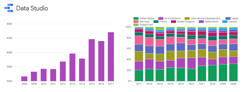
I have a strong interest in international development and aid flows. Luckily, this data is readily available through sources such as the OECD. In this example, I will be looking at official development assistance (ODA), a key measure of international aid, by source (donor) and sector. Sources include countries and multilateral organisations, while sectors (end uses for the aid) may be areas like education, health, energy, or water and sanitation.
Here’s the full official development assistance report:
As you can see, we have a number of charts visualising aid contributions. A pie (or doughnut!) chart shows the share of donor money by destination sector. Overall, we can see that “social infrastructure and services” receives the biggest single share, although the spread is fairly even for most sectors. We model total ODA by year in bar charts, as well as visualising the top contributors each year with a stacked bar chart. We also have filter functionality, a core feature of the data analysis enabled by this dashboard. Here, I’ve included three filters – year, sector, and donor – which can be selected and applied to all of the visualisations in the report.
Further down, we have a map visualisation of aid contributions by country – again, very cool native functionality of Google Data Studio. We could filter by a sector or year, and see the map update accordingly. Finally, we have a simple, yet effective, data table showing each donor and their relative value of ODA contributions. All of these chart elements are interactive – they can be clicked on to filter the report. So, if we wanted to look at Japan’s contributions for example, we could use the filter at the top of the report or simply click on Japan on the world map. The data would dynamically refresh accordingly.
This dashboard is a fairly simple example of what can be done with Google Data Studio. However, there are a lot of features and we already have a dynamic, clear dashboard that users – casual and data analysts alike – can interact with to visualise and better understand a static CSV dataset. As with most visualisation tools, the data is separate to the report itself, so if we wanted to plug in another file – say an update from OECD with a new CSV file – we can simply import this to Google Data Studio and change the data source for the entire dashboard. A huge time-saver over traditional, more manual methods of generating charts and data visualisations.
I hope this has shown that Data Studio and other visualisation tools can have use for analysts beyond the common integrations with marketing tools like Google Analytics. If you have any queries or would like more information, feel free to leave a comment or contact me. I provide support on a wide range of data analytics and digital projects, from implementation and tagging to reporting, dashboarding, and visualisation, through to training and consultancy.