I’m currently offering a few fixed cost packages to help charities and non-profits get insight from the new Google Analytics 4 (GA4):
Training for reporting & analysis in GA4
Looker Studio dashboard using GA4 BigQuery data
Customised GA4 reporting walkthrough
Contact me if interested! (Non-profits/charities/education/social impact only.)
You can also connect with me by email or via LinkedIn
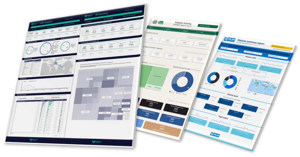
As an expert digital analytics freelancer, I have already delivered Google Analytics 4 training and dashboards to several major clients, with excellent feedback. I’m highly experienced in providing GA4 training for charities and non-profits. I’ve also produced many high quality, on-brand reporting GA4 dashboards.
I’ve taken the time to master the intricacies of reporting in GA4, BigQuery, and Looker Studio, so you don’t have to. For a simple one-off payment, you’ll receive high quality, tried and tested deliverables on a quick timescale.
I can also offer support with these digital analytics tools as part of a wider freelance analytics consultancy engagement for your charity or non-profit.
Daniel has been invaluable in helping us to translate often complex and confusing data into meaningful insights and opportunities, in order to continually improve our websites and apps.
It’s been an absolute pleasure to work with Daniel.
We needed a better way to access our face-to-face fundraising data from the Evergiving platform. The data reporting Daniel produced for us was of excellent quality and exactly what we were looking for, and has had a very positive impact on streamlining our processes.
The training he delivered was also excellent – he is very thorough and patient and we hope to work together again soon.
With much fanfare, Google have launched Google Analytics 4 (GA4) and rebranded Looker Studio. They’ve also seen fit to destroy the most simple, established way to create custom reporting dashboards with these tools.
Cue facepalms for analysts and marketers alike. Let’s try to get our data working positively again.
Tommy’s is a charity organisation committed to saving babies’ lives. We fund pioneering research and support families through every part of the pregnancy journey.
Tommy’s has been a core analytics client of mine since 2020. Like most large non-profits, they have a wide range of digital products supporting diverse activities. With one of the UK’s most visited charity websites – tens of thousands of daily visitors to the main site alone – there is a wealth of data to organise and make sense of.
Working closely together, we have delivered reliable data analytics leading to actionable insight. This spanned the launch of a new website in 2020 through to ongoing monitoring, evaluation, and optimisation of Tommy’s activities. Our work together has covered several high-profile websites, apps, campaigns, and digital channels. I have brought a wide range of skills and knowledge to these projects, while constantly learning and adapting to support the highest quality results.
Work delivered includes:
A range of deep-dive analysis, highlighting opportunities for UX, content, and campaign improvements
A conversion rate optimisation (CRO) process, principles, and materials
Individual CRO experiments leading to conversion uplift and highly actionable insights
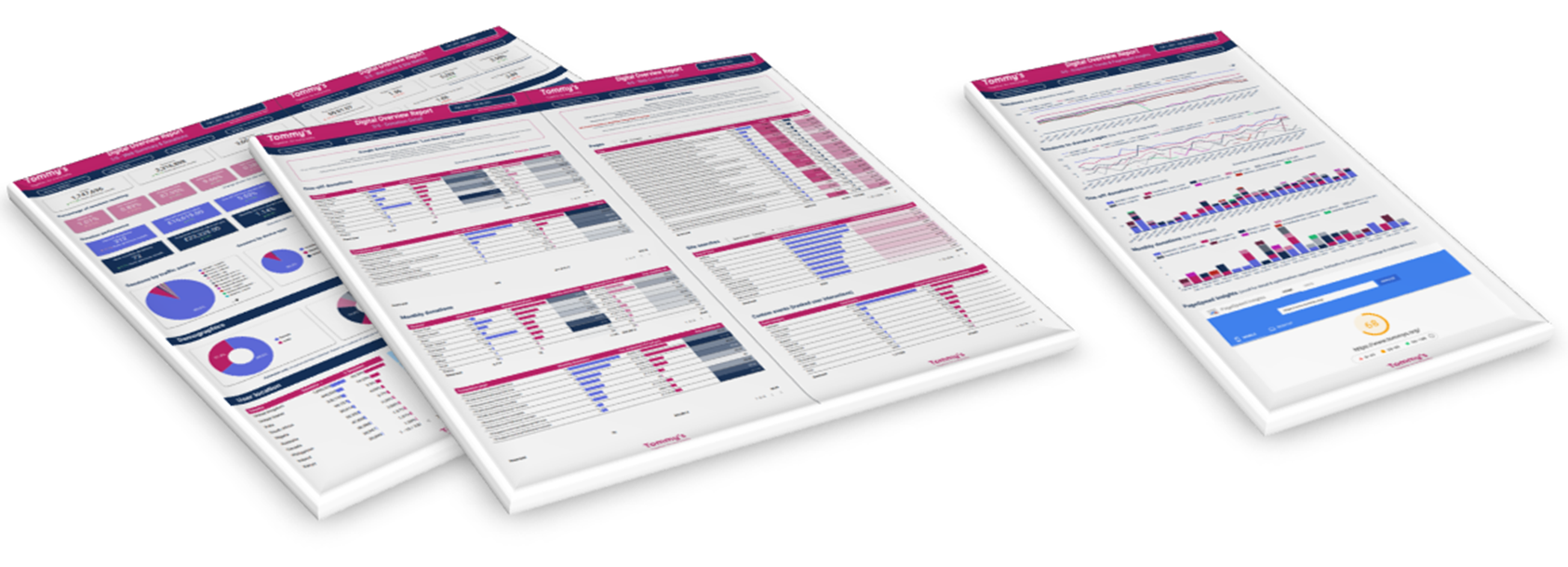
Bespoke website reporting dashboards created in Looker Studio
Strategic guidance on analytics approaches, platforms, tools, and integrations
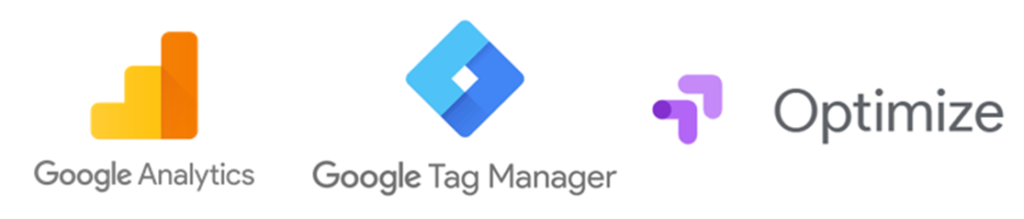
A highly customised multi-site analytics setup, featuring Google Tag Manager, Universal Analytics, GA4, and Google Optimize.
Training, walkthroughs, and handover with Tommy’s team and consultants
Support with tracking and evaluating advertising and social media campaigns
Daniel has been invaluable in helping us to translate often complex and confusing data into meaningful insights and opportunities, in order to continually improve our websites and apps.
Highlight: Surfacing opportunities through analysis
We have carried out several pieces of “deep-dive” analysis across Tommy’s website: detailed data analysis looking at many aspects of web content and user conversion. I am always keen for analysis to present opportunities for improvement, which could relate to UX, content, or communications driving traffic to the site.
Our deep-dive analysis work has accelerated in recent times, feeding directly into Tommy’s strategic web development roadmap. It also provides a sound basis of quantitative insight – and inspiration! - for our CRO programme.
We have helped to evaluate the overall performance of Tommy’s website, focusing on traffic profiles, user journeys, and a range of key outcomes across the site. As well as this broad analysis, we have delivered granular insight into specific areas, like the donation process and Tommy’s popular pregnancy tools.
Most recently, we analysed the performance of Tommy’s new Miscarriage Support Tool in depth. The Miscarriage Support Tool uses an algorithm developed by the University of Warwick and is based on data collected from Tommy’s National Centre for Miscarriage Research. Our insights fed directly into development improvements and enhanced recruitment for user research, receiving positive feedback from within Tommy’s.
Highlight: Conversion rate optimisation
A core specialism throughout my career has been conversion rate optimisation (CRO). Through structured AB or multivariate tests – randomised control trials - we can get true “cause and effect” insight on website changes.
I have brought years of successful CRO experience to Tommy’s, helping them to:
Identify CRO tools on the market and choose a solution
Understand strategy, best practice, and rationale around CRO
Embed a clear, rigorous process and documentation
Demonstrate the tools
Set up individual tests
Integrate CRO with rich web analytics
Analyse and share results, making clear recommendations for next steps
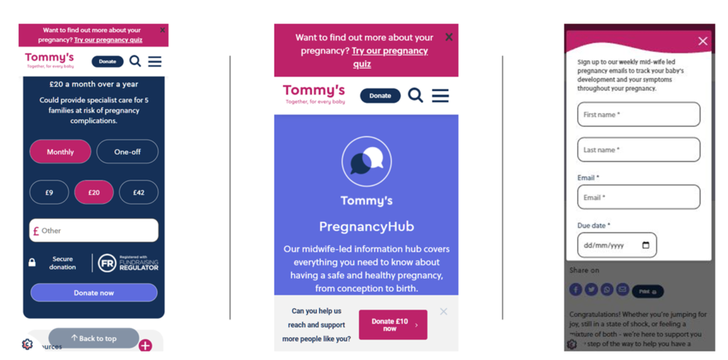
We gained momentum in our CRO programme across 2021-22. Our first major test was a success: we trialled two popup variants on Pregnancy Hub pages, asking users to sign up to pregnancy support emails. We had to ensure that the popup was not shown at inappropriate times, such as on pages relating to baby loss. We also did not want to damage the overall user experience and cause abandonment from the site.
The test resulted in a clear winning popup variant, with over four times the email signup conversion of the control (gaining hundreds of extra signups over the test period). We also increased the marketing opt-in rates from completed signups, and improved overall website engagement rates, making this test a resounding success for positive uplift.
Next, we focused heavily on optimising the website donation process. We carried out several tests, starting with introducing an inline donation widget to high-traffic pages then moving on to testing donation popups across different site sections. We also completed iterative rounds of testing on the donation form prompts, aiming to find optimal values and understand the behavioural economics underpinning donor choices.
Our tests so far have been extremely useful. They have either given us direct conversion uplift or helped increase our understanding of user behaviour and guide development priorities.
Some successful variants from our CRO tests.
Highlight: Multi-site analytics setup
All data analytics needs a good implementation at its heart. This is particularly true for Tommy’s: several websites, apps, and platforms generate a huge continuous stream of visits, interactions, and conversions.
I was fortunate to come on board several months before the launch of Tommy’s new website in 2020. This enabled us to think through solutions, map out what we wanted to track (and why), and work closely with web developers. I advocated a clean, modular, consistent approach using the Google suite of products. Central to this was using Google Tag Manager (GTM) to help us deploy analytics and marketing tags with relative ease. I proposed a custom data layer for rich information capture – for areas like donation transactions and marketing opt-ins - briefing developers and providing thorough feedback to achieve this. We also integrated Google Optimize across the main website for CRO experiments and personalisations.
Initially, I set up a comprehensive Google Universal Analytics (UA) solution for Tommy’s main website via GTM. We have since extended the solution to several microsites and a mobile app, My Prem Baby. In 2022, we completed a complex rollout of the new Google Analytics 4 (GA4). I created a comprehensive GTM/GA4 solution design, which doubles as a handy reporting reference. I have also facilitated the setup of other tools, such as Wisepops to help us AB test website popups.
I am stepping back from hands-on implementation but have left solid foundations and practices in place for the future. From the beginning, I strove to explain to Tommy’s what we were doing and why, so that the solution did not become a “black box”. In reporting and analysis, I clearly outline caveats and limitations with the data, which ultimately aids understanding and insight. I have demonstrated various tools and technical concepts to Tommy’s and their consultants over the course of our work, to ease the handover of the analytics setup.
What’s next?
I am continuing to work closely with Tommy’s, with renewed focus on insight and optimisation.
My strategic aim is to use organisations’ existing data and capabilities to their fullest potential. Working with Tommy’s and their developers, we hope to roll out many more CRO tests and website enhancements in 2023.
Our overarching objectives are to improve the user experience and support good outcomes for those who use Tommy’s services and content. Positive social impact is what drives me as an analytics specialist working with non-profits; I’m pleased to be a part of achieving this through Tommy’s crucial work.
If you'd like to discuss how I can help your charity with data analytics, you can find me on LinkedIn, or email me at [email protected]
We use some common tools to run this website and evaluate your experience anonymously, like Google Analytics and functional browser cookies. We don't track you across the web or target you with ads.
By clicking “Accept All”, you consent to the use of all our cookies.
You may click "Cookie Settings" to consent to different cookie groups.
This website uses cookies to enhance your experience while you navigate through the website. Out of these, the cookies that are categorised as necessary are stored on your browser, as they are essential for basic functionality of the website. We also use third-party cookies that help us provide website features, and better understand (anonymously) how users engage with this website. These cookies will be stored in your browser only with your consent. You also have the option to opt-out of these cookies. Opting out of some of these cookies may affect your browsing experience and our ability to maintain and improve the website.
Necessary cookies are absolutely essential for the website to function properly. These cookies ensure the basic functionality and security features of the website, anonymously.
Cookie
Duration
Description
cookielawinfo-checkbox-analytics
11 months
This cookie is set by GDPR Cookie Consent plugin. The cookie is used to store the user consent for the cookies in the category "Analytics".
cookielawinfo-checkbox-functional
11 months
The cookie is set by GDPR cookie consent to record the user consent for the cookies in the category "Functional".
cookielawinfo-checkbox-necessary
11 months
This cookie is set by GDPR Cookie Consent plugin. The cookies is used to store the user consent for the cookies in the category "Necessary".
cookielawinfo-checkbox-others
11 months
This cookie is set by GDPR Cookie Consent plugin. The cookie is used to store the user consent for the cookies in the category "Other.
cookielawinfo-checkbox-performance
11 months
This cookie is set by GDPR Cookie Consent plugin. The cookie is used to store the user consent for the cookies in the category "Performance".
viewed_cookie_policy
11 months
The cookie is set by the GDPR Cookie Consent plugin and is used to store whether or not user has consented to the use of cookies. It does not store any personal data.
Functional cookies help you to perform certain convenient actions like sharing web pages on social media, submitting feedback, and other third-party features.
Analytics cookies are used to anonymously understand how visitors interact with the website. These cookies help provide information on metrics link the number of visitors, bounce rate, traffic source, etc. A typical analytics platform is Google Analytics, which is ubiquitous across the web.