
Getting a hold of your data and doing some analysis is only one part of the equation. In data analytics – like in most fields – communication is key. Presentation of data that is impactful, easy-to-digest, and conveys key analytical insights is essential if you want to to use your data effectively.
Visualisation of digital data, from simple bottom-line reports or analysis summaries, to in-depth analysis and discussion of insights, is extremely important to drive data-driven decision making. In my opinion, the cliché of “simple, easy-to-read reports for directors or senior management” is a bit misleading. Executives are usually more than capable of appreciating complex insights from data, but like anyone they want clear, concise information that can be produced and understood without doubt or unnecessary effort.
It’s been an absolute pleasure to work with Daniel.
We needed a better way to access our face-to-face fundraising data from the Evergiving platform. The data reporting Daniel produced for us was of excellent quality and exactly what we were looking for, and has had a very positive impact on streamlining our processes.
The training he delivered was also excellent – he is very thorough and patient and we hope to work together again soon.

Modern tools such as Microsoft Power BI or Google Data Studio can make data a joy to work with, although of course there is still a place for intelligent, effective use of basic tools such as Excel and PowerPoint. I have years of experience working in all of these tools to distil and present digital data analysis to audiences at all levels. Many tools also allow an element of automation, for example exporting Google Analytics data to Google Sheets to take the pain away from regular web analytics reporting. My expertise in programming and broad experience with configuring and using business software enables me to set up useful automations with ease on a range of platforms.
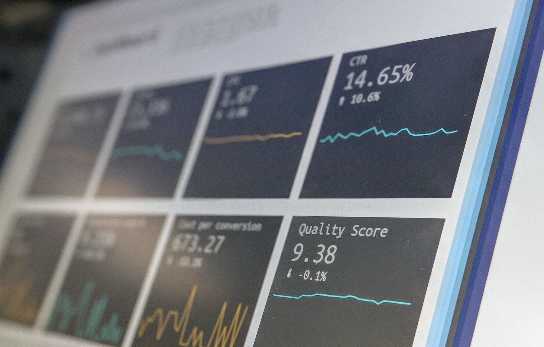
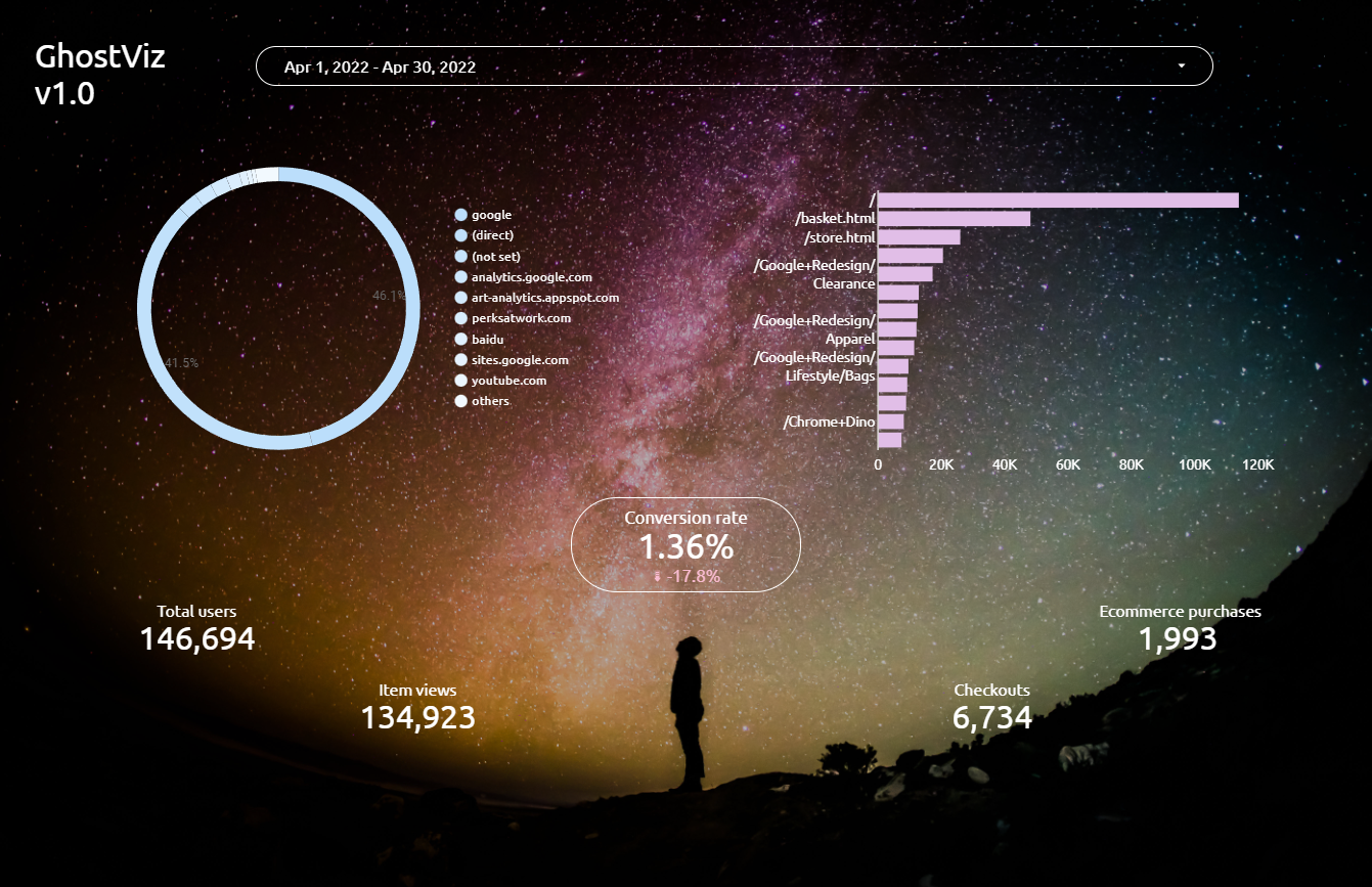
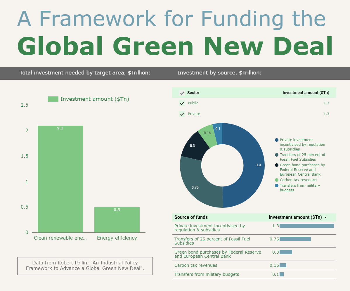
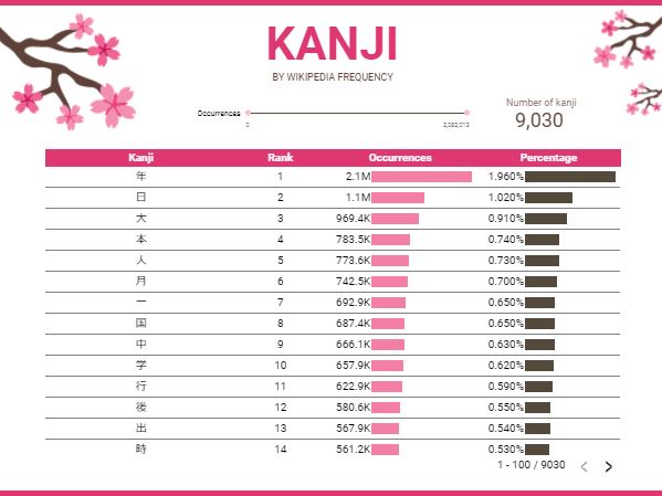
Data visualisation examples (non-client work)
Unfortunately, I'm unable to share complete examples of data visualisations and dashboards completed for my clients.
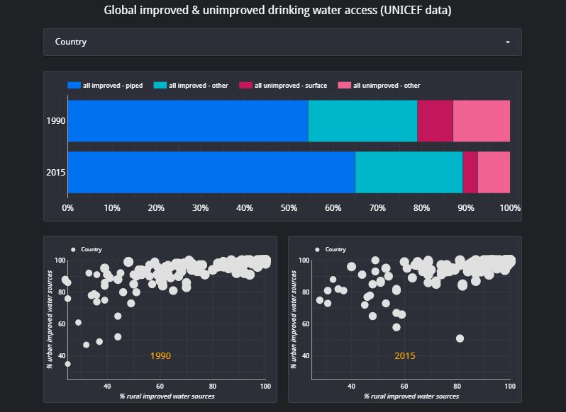
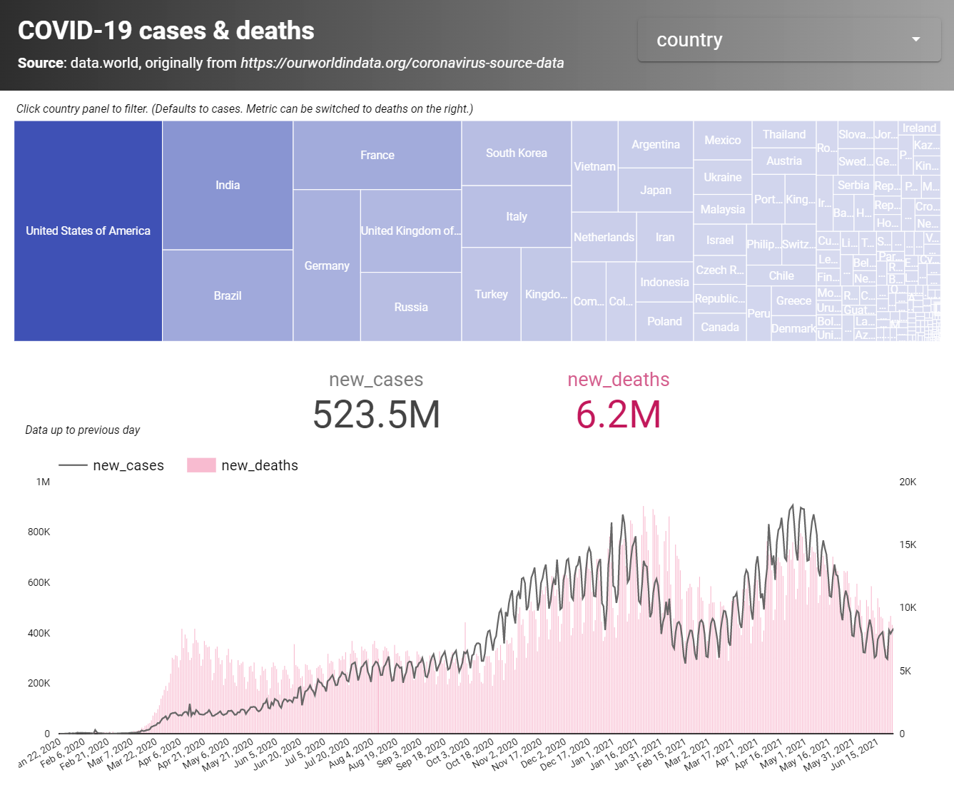
Here's a small snapshot of simple visualisations I've created in Google Data Studio, on various themes:

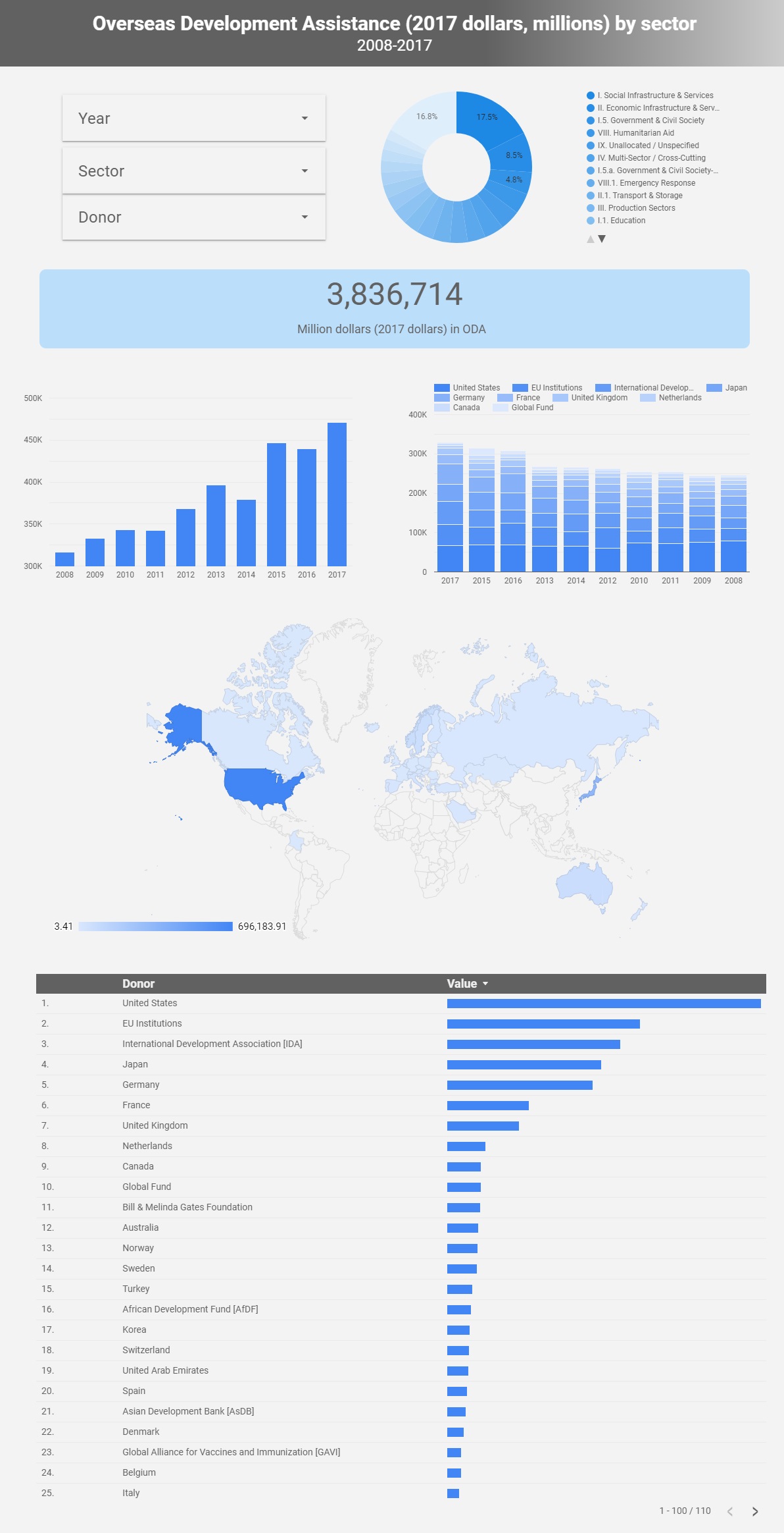
- Blog on visualising CSV data in Google Data Studio, with aid flows as an example
- Blog on visualising open source data using Data Studio, looking at global water access
- Blog comparing Google Data Studio with Microsoft Power BI for creating dashboards and data visualisations
From reporting dashboards for wide consumption, to detailed reports for specific teams or stakeholders, I can add significant value to your data analytics through data visualisation and report automation.
You can find me on LinkedIn, or email me at [email protected]
I look forward to hearing about your exciting data visualisation and automation projects!
Daniel has been a huge help to us at Link. Having recently launched a new website, we worked with Daniel to audit our digital analytics needs and capabilities.
Daniel was extremely flexible and responsive to our situation. He worked with us to deliver a package of work that was bespoke to our needs, in line with our budgets, and would give us maximum impact for our current situation. He kindly accommodated our tight timelines and always turned work around quickly and efficiently.
As a charity, we really appreciated his expert subject knowledge in our field as well as his clear expertise in analytics and we wouldn’t hesitate to work with him again in the future.
