
Google Data Studio is becoming the go-to reporting tool for data analysts in many sectors. In this article I take a look beyond the typical marketing data connectors like Google Analytics and delve into open source data from a wealth of freely-available sources, courtesy of data.world.
No need for complex engineering or data pipelines – with just a little bit of SQL and using Data Studio’s native connector, a whole new world of data can be delivered right to your dashboards!
As many of you know, Google Data Studio offers several data connectors to visualise data from various sources in one report or dashboard. As primarily a marketing platform, sources like Google Analytics, Google Ads, and Facebook (third party connector) are commonplace. As covered in a previous post, you can also connect custom data through CSV files or SQL databases.
But the web is evolving.
Google now offers Dataset Search, which is a sign of things to come. Use of large datasets (“big data” – is the term old fashioned now?) will become more and more commonplace, while more people will have the skills and access to data sources. Falling in with this trend is an excellent connector I discovered in Data Studio for data.world.
A whole new world… of open source data
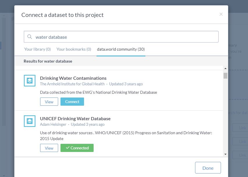
data.world is “home to the world’s largest collaborative data community, which is free and open to the public”. The platform compiles thousands of open data sources, allowing users to pull these into “projects” and download them or query them with SQL. Amazingly, it also has a native connector to Google Data Studio. Thrilling news if you are a data analyst whose interests go beyond marketing and advertising activities. As an example, one of their own demos looks at data for shootings in US. Here, I’m going to look at one of my favourite international development issues: water access.
The first thing you need to do is sign up for a data.world account. This is free for individuals and currently offers 3 private projects, where you can pull in multiple open source datasets, and 100MB per project. There are also paid tiers for larger capacity or multiple members at the enterprise level.
Once you have your data.world account, you can go ahead and create a project and find the datasets you are interested in. In my case, I found a few water-related datasets, including “UNICEF Drinking Water Database”:
The data sets also come with source info attached. One you have datasets in your project, you can browse the data via an Excel-like interface and also query them within the project space via SQL.
Project and datasets created, it’s time to move to Google Data Studio to start visualising the data!
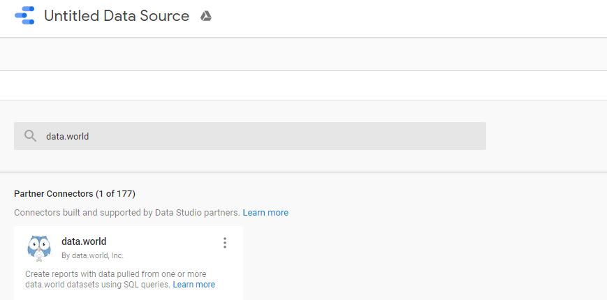
Connecting to Google Data Studio
In Data Studio, when you create a new Data Source, you’ll see a search bar along with some of the usual suspects, including Google Analytics. Just search for data.world and you’ll see the connector under “Partner Connectors”:
Next, you’ll be prompted to authenticate using both Google and data.world. If you’re logged into both platforms with the correct account, you should be fine.
To define your data source within Data Studio, you’ll need your data.world project URL and a SQL query to extract the data.
Here’s my example:
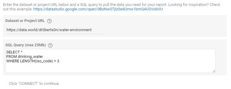
Often, you’ll simply extract all the fields from the relevant dataset. You can see I have a slight modification to pull in only validated country data with an ISO code. Note you can find the table name from within your data.world project: just go into the dataset and query it in the data.world interface and you’ll see the relevant table name (in this case “drinking_water”) in the template SQL query.
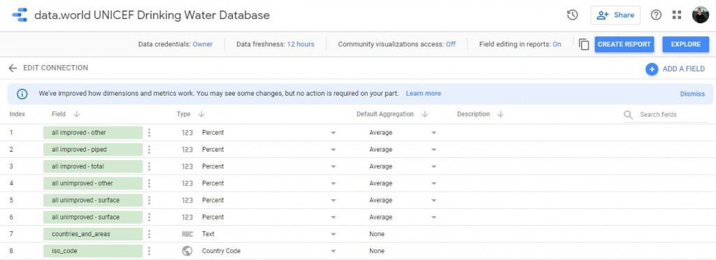
Once your fields are in Data Studio, you might need to do some data cleansing by setting the field types and customising field names:
Now we’re ready to create the report!
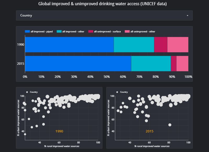
The result: Water access data visualisation
Provided you’ve set up your SQL query correctly and understand the structure of your dataset, you can use Data Studio pretty much as you normally would for Data Sources like Google Analytics. That means all the usual filters, charts, layouts, and themes.
Here’s my final report on improved and unimproved water sources via UNICEF data.
The report offers a visual comparison of improved and unimproved drinking water in 1990 vs. 2015. We also have scatterplots for each year, showing urban and rural coverage of improved drinking water. A report level filter allows us to view individual countries or groups.
I hope this article has been helpful and you’re now inspired to work with the ocean (no lakes ;) of fascinating data out there.
If you’d like support on the type of project covered in this article, or anything analytics-related, please feel free to get in touch with me.