
Following my recent posts on data visualisation and Google Data Studio, I thought I’d share another demo of the potential to visualise data beyond marketing analytics.
Once again, using the fantastic data.world open source platform, I’ve created a project for the COVID-19 crisis, which imports data from an external source. I can then link to this in Google Data Studio, along with a simple SQL query to extract the data I’m interested in.
It’s always crucial to validate your data structure and match your results against different data sources, whether you are using public health data or something like Google Analytics.
Hard part done, we can then use Google Data Studio’s excellent features to visualise the data in a clean, crisp, and automated way as we normally would.
My resulting COVID-19 cases & deaths dashboard can be found here.
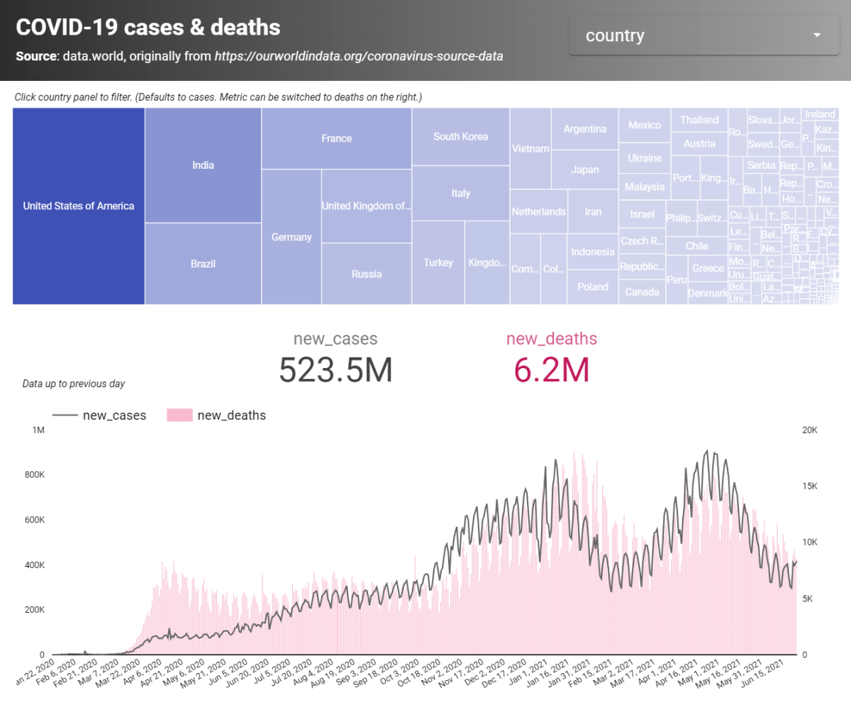
The information comes from this dataset on data.world. Generally, the data should be fresh up to the previous day. The original source is from https://ourworldindata.org/coronavirus-source-data.
Dashboard features
- Treemap showing confirmed COVID-19 cases by country. The treemap is clickable, so you can click on a country panel to filter the report.
- Optional metric (top right of the treemap) to switch the treemap to COVID-19-related deaths.
- Drop-down/search filter for all countries.
- Total confirmed cases and total deaths.
- Chart of the daily case (log scale) and daily death trends.
If you would like to know more about setting up reports like these and visualising open-source data, please feel free to get in touch!