Children’s camps case study: Over the Wall

Over The Wall is a UK based charity for children and young people with health challenges and disabilities to discover a world of mischief and magic.

We provide a safe place to step outside of comfort zones, establish friendships and build confidence through meaningful and exciting activities.

For much of 2023, I have been working closely with Over the Wall to help automate data reporting across the organisation. Our aim is to streamline the insights that can be achieved from highly diverse data sources, supporting better real-time decision making with greater consistency and trust.

The project has involved working collaboratively with teams and business functions across the organisation, primarily in operations and fundraising.

Work delivered includes:

  • Discovery in the form of a comprehensive analytics capability review.
  • Rolling out Power BI reports for camper & volunteer recruitment.
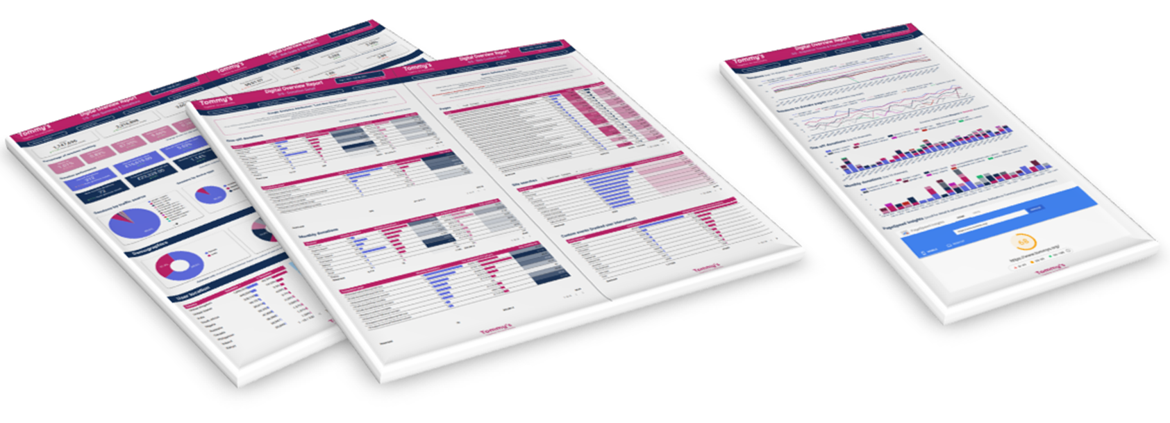
  • Drafting a Power BI report for fundraising results & opportunities.
  • Assessing data pipeline tools and workflows and providing appropriate system recommendations
  • Training & documentation to smooth the adoption and handover of reports.

Daniel has been a joy to work with.

He has taken a relatively vague brief and worked with our staff to create highly useable KPI dashboards that have enabled us to view performance in real time, become more analytical and make smarter tasking decisions.

This in turn has raised our productivity saving time/money on an ongoing basis.

Kevin Mathieson

Analytics capability review

Our project began with a full review of Over the Wall’s current data analytics capability.

Before launching into creating reports or analysis, it is essential to understand the context, needs, and aims of the organisation. Equally, we need to demonstrate what can be achieved with data analytics and how simple or challenging that might be. Concrete examples can greatly improve briefing for individual reports. Overall, getting insight from data is much more efficient when approached from a place of better shared understanding.

The capability review involved:

  • Identifying, testing, and evaluating the range of data sources and systems available to Over the Wall.
  • Interviewing and surveying stakeholder teams to understand their specific needs and pain points around data and insight.
  • Creating a draft Power BI report template as a proof of concept for combining multiple different data sources into one view.
  • Delivering a detailed written report to Over the Wall, including data analytics-related findings and recommendations for the short, medium, and long term.

With engagement from the team, we were able to identify several issues and opportunities around data. We could also anticipate possible roadblocks or issues, both in terms of the tech and the organisational context.

In delivering the findings and recommendations, it was helpful to classify each into three broad areas that consistently emerged:

  1. Systems & platforms
  2. People & processes
  3. Data output & analysis

This helped to rationalise our evaluation to Over the Wall and made prioritising next steps clearer and easier.

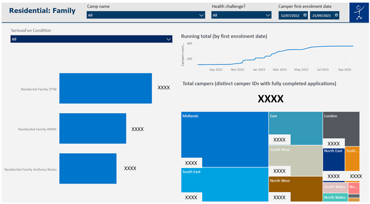
Camp operations reporting

Having interpreted the capability review and prioritised internally based on readiness and need, Over the Wall agreed to focus initial efforts on a suite of reports for camp operations. This would get us up and running with useful reports that would potentially save the team a lot of manual reporting effort, while serving as a template for rolling out automated Power BI reporting to other areas of the organisation.

With the assistance of Over the Wall’s operations team, I immersed myself deeply in the complicated data, systems, and processes around camper and volunteer recruitment. We followed a dynamic, iterative approach to refine requirements and steadily improve the reports to get them in a good state for the team.

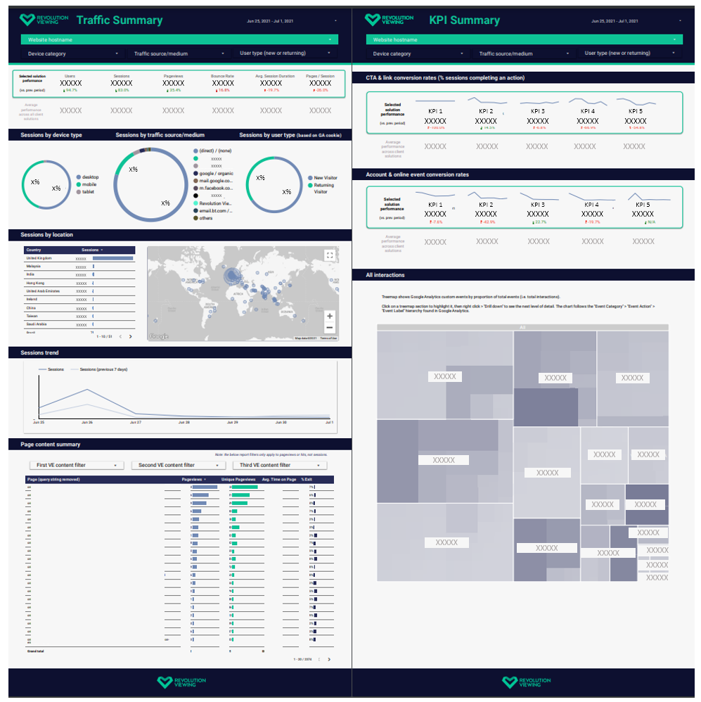
We produced three distinct reports, primarily based on data from CampSite – a bespoke camp management CRM system – but also including data from other sources, such as internal KPI targets. The data pipeline was relatively complex and involved creating custom CampSite reports with paginated API calls to extract all the useful data into Power BI. Reports ranged from a simple one-page “camper lookup” to make key personal and health details more accessible internally, to a twelve-page deep dive of camper recruitment performance across different camp types and application stages.

Once Over the Wall were happy with the reports, we published “release” versions covering 2023 camper and volunteering recruitment to the Power BI Service, ready for sharing and active use. These then served as a basis for the subsequent 2024 suite of reports, which were developed in late 2023 once the new 2024 recruitment processes were opened.

Sample page from a camper recruitment report.

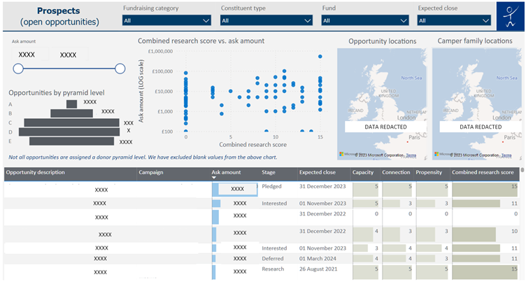
Fundraising reporting

Once we reached a stable point with 2023 operations reporting, we picked up discussions with the fundraising and finance teams. Ultimately, we decided to focus on fundraising reports for our next phase, as the systems and requirements were at a more advanced stage to be able to proceed with pulling data into Power BI.

We made sure to capture a comprehensive set of requirements based on a briefing template I provided. I interrogated the brief and collaborated with the team over video calls and shared documents to ensure that I fully understood the meaning behind each request and how it mapped to data sources.

Once comfortable with most requirements, the next step for me was to produce a draft report. This achieved several requirements and showed Over the Wall the scope of what we could achieve in our data visualisations. The report combines rich fundraising data from the Donorfy CRM with camper data from CampSite, along with targets and category mappings held in separate Excel spreadsheets within Microsoft 365. Key features of the report include monthly performance vs. targets using an intuitive time period selector, yearly summary, performance by fund and campaign, and an opportunities explorer to help surface and categorise the most promising fundraising prospects.

Through the report creation process, Over the Wall identified several areas where the underlying Donorfy data could be cleaned, extended, or made more consistent. This will be undertaken by Over the Wall in early 2024, after which the report will be iteratively developed to make full use of the new, cleaner source data and satisfy the full insight brief.

Sample page from our fundraising report.

Training & handover

It’s crucial for clients to be confident enough to understand and interrogate reports to get the insight they need. Some ability to maintain and update reports is also useful, although this can be challenging for non-experts when it comes to a complicated platform like Power BI and its bespoke data pipelines. 

With Over the Wall, we demonstrated several features at appropriate stages in the development process. These features included the two different Power BI environments, report navigation, filters, slicers, cross-highlighting, and drilling into underlying data. We produced a reporting walkthrough guide and ran a live training session with the operations team.

For fundraising, we also provided detailed technical handover notes on the report setup and data sources. This will help other users take over report development, updates, and maintenance in 2024.

Conclusion

We have produced a varied, useful set of automated reports for key Over the Wall business functions. In doing so, we assessed the organisation’s analytics capability and identified much of what they need to attain better insight in future. Through our Power BI report development, we also helped to highlight issues with existing data collection and underlying systems, which Over the Wall are now working to improve.

Teams are much more familiar with Power BI – and report automation in general – than they were previously: I strove to explain and document my work throughout, rather than simply providing “black box” report outputs. A crucial success factor for me is that individuals and teams are empowered to get more out of data themselves: I feel that Over the Wall, having already had a strong skill set across the team, are well along this path.

I believe we have laid some solid foundations for Over the Wall to develop and grow their data analytics insights long after my consultancy has ended. I sincerely hope these capabilities can help the organisation go from strength to strength in providing their wonderful service to children and young people with health challenges and disabilities.

You can find me on LinkedIn, or email me at [email protected]

(Please note I'm no longer freelancing, but keen to connect with others in the world of data for social impact!)

Pregnancy charity case study: Tommy’s

Tommy’s is a charity organisation committed to saving babies’ lives. We fund pioneering research and support families through every part of the pregnancy journey.

Tommy’s has been a core analytics client of mine since 2020. Like most large non-profits, they have a wide range of digital products supporting diverse activities. With one of the UK’s most visited charity websites – tens of thousands of daily visitors to the main site alone – there is a wealth of data to organise and make sense of.

Working closely together, we have delivered reliable data analytics leading to actionable insight. This spanned the launch of a new website in 2020 through to ongoing monitoring, evaluation, and optimisation of Tommy’s activities. Our work together has covered several high-profile websites, apps, campaigns, and digital channels. I have brought a wide range of skills and knowledge to these projects, while constantly learning and adapting to support the highest quality results.

Work delivered includes:

  • A range of deep-dive analysis, highlighting opportunities for UX, content, and campaign improvements
  • A conversion rate optimisation (CRO) process, principles, and materials
  • Individual CRO experiments leading to conversion uplift and highly actionable insights
  • Bespoke website reporting dashboards created in Looker Studio
  • Strategic guidance on analytics approaches, platforms, tools, and integrations
  • A highly customised multi-site analytics setup, featuring Google Tag Manager, Universal Analytics, GA4, and Google Optimize.
  • Training, walkthroughs, and handover with Tommy’s team and consultants
  • Support with tracking and evaluating advertising and social media campaigns

Daniel has been invaluable in helping us to translate often complex and confusing data into meaningful insights and opportunities, in order to continually improve our websites and apps.

Catherine Filmer

Highlight: Surfacing opportunities through analysis

We have carried out several pieces of “deep-dive” analysis across Tommy’s website: detailed data analysis looking at many aspects of web content and user conversion. I am always keen for analysis to present opportunities for improvement, which could relate to UX, content, or communications driving traffic to the site.

Our deep-dive analysis work has accelerated in recent times, feeding directly into Tommy’s strategic web development roadmap. It also provides a sound basis of quantitative insight – and inspiration! - for our CRO programme.

We have helped to evaluate the overall performance of Tommy’s website, focusing on traffic profiles, user journeys, and a range of key outcomes across the site. As well as this broad analysis, we have delivered granular insight into specific areas, like the donation process and Tommy’s popular pregnancy tools.

Most recently, we analysed the performance of Tommy’s new Miscarriage Support Tool in depth. The Miscarriage Support Tool uses an algorithm developed by the University of Warwick and is based on data collected from Tommy’s National Centre for Miscarriage Research. Our insights fed directly into development improvements and enhanced recruitment for user research, receiving positive feedback from within Tommy’s.

Highlight: Conversion rate optimisation

A core specialism throughout my career has been conversion rate optimisation (CRO). Through structured AB or multivariate tests – randomised control trials - we can get true “cause and effect” insight on website changes.

I have brought years of successful CRO experience to Tommy’s, helping them to:

  • Identify CRO tools on the market and choose a solution
  • Understand strategy, best practice, and rationale around CRO
  • Embed a clear, rigorous process and documentation
  • Demonstrate the tools
  • Set up individual tests
  • Integrate CRO with rich web analytics
  • Analyse and share results, making clear recommendations for next steps

We gained momentum in our CRO programme across 2021-22. Our first major test was a success: we trialled two popup variants on Pregnancy Hub pages, asking users to sign up to pregnancy support emails. We had to ensure that the popup was not shown at inappropriate times, such as on pages relating to baby loss. We also did not want to damage the overall user experience and cause abandonment from the site.

The test resulted in a clear winning popup variant, with over four times the email signup conversion of the control (gaining hundreds of extra signups over the test period). We also increased the marketing opt-in rates from completed signups, and improved overall website engagement rates, making this test a resounding success for positive uplift.

Next, we focused heavily on optimising the website donation process. We carried out several tests, starting with introducing an inline donation widget to high-traffic pages then moving on to testing donation popups across different site sections. We also completed iterative rounds of testing on the donation form prompts, aiming to find optimal values and understand the behavioural economics underpinning donor choices.

Our tests so far have been extremely useful. They have either given us direct conversion uplift or helped increase our understanding of user behaviour and guide development priorities. 

Some successful variants from our CRO tests.

Highlight: Multi-site analytics setup

All data analytics needs a good implementation at its heart. This is particularly true for Tommy’s: several websites, apps, and platforms generate a huge continuous stream of visits, interactions, and conversions.

I was fortunate to come on board several months before the launch of Tommy’s new website in 2020. This enabled us to think through solutions, map out what we wanted to track (and why), and work closely with web developers. I advocated a clean, modular, consistent approach using the Google suite of products. Central to this was using Google Tag Manager (GTM) to help us deploy analytics and marketing tags with relative ease. I proposed a custom data layer for rich information capture – for areas like donation transactions and marketing opt-ins - briefing developers and providing thorough feedback to achieve this. We also integrated Google Optimize across the main website for CRO experiments and personalisations.

Initially, I set up a comprehensive Google Universal Analytics (UA) solution for Tommy’s main website via GTM. We have since extended the solution to several microsites and a mobile app, My Prem Baby. In 2022, we completed a complex rollout of the new Google Analytics 4 (GA4). I created a comprehensive GTM/GA4 solution design, which doubles as a handy reporting reference. I have also facilitated the setup of other tools, such as Wisepops to help us AB test website popups.

I am stepping back from hands-on implementation but have left solid foundations and practices in place for the future. From the beginning, I strove to explain to Tommy’s what we were doing and why, so that the solution did not become a “black box”. In reporting and analysis, I clearly outline caveats and limitations with the data, which ultimately aids understanding and insight. I have demonstrated various tools and technical concepts to Tommy’s and their consultants over the course of our work, to ease the handover of the analytics setup.

What’s next?

I am continuing to work closely with Tommy’s, with renewed focus on insight and optimisation.

My strategic aim is to use organisations’ existing data and capabilities to their fullest potential. Working with Tommy’s and their developers, we hope to roll out many more CRO tests and website enhancements in 2023.

Our overarching objectives are to improve the user experience and support good outcomes for those who use Tommy’s services and content. Positive social impact is what drives me as an analytics specialist working with non-profits; I’m pleased to be a part of achieving this through Tommy’s crucial work.

If you'd like to discuss how I can help your charity with data analytics, you can find me on LinkedIn, or email me at [email protected]

Higher education case study: Vepple, by Revolution Viewing

Vepple is an always on virtual experience platform created specifically for Higher Education student recruitment, with a focus on personalisation to increase conversion.

In developing and launching a virtual experience platform for several universities, Revolution Viewing identified the need for structured data analytics to support its growth.

They commissioned me to design and implement web analytics, assist with reporting, and uncover deeper insights about user engagement and conversion. 

What did we do?

  • Review of new user features, client strategy, and existing analytics reports.
  • Bespoke digital measurement framework, covering stages in the prospective student journey.
  • Mapping this strategic measurement framework to a concrete web analytics solution design.
  • Designing and briefing a data layer to support analytics data collection.
  • Multi-property setup of Google Analytics (GA) and configuration in Google Tag Manager (GTM).
  • Looker Studio dashboard to summarise performance across all Vepple experiences.
  • Deep-dive analysis to help evaluate Vepple, challenge qualitative research, provide insight to universities, and assist marketing efforts.
  • Ongoing updates to the data layer and GA setup as Vepple features evolved.
  • Ongoing consultancy and advice on the analytics setup and data analysis.

Sample from our Vepple Looker Studio insight dashboard

What was the outcome?

  • Revolution Viewing and their university partners have been able to rely on a full suite of web analytics data, from the initial launch of Vepple through various feature updates.  
  • A rich set of data is being collected for Revolution Viewing’s own Universal Analytics and GA4 properties. Client universities have the additional option to integrate their own GA properties with Vepple.
  • The analytics solution is future-proof due to the early inclusion of GA4 and strong GTM + data layer foundations.
  • Summary Vepple performance can be viewed easily, via a dynamic dashboard that can be filtered by different universities and user journeys.
  • Deep-dive analysis has uncovered key insights that showcase the strong performance of Vepple as a content and conversion platform for prospective university students. These insights have been shared with university partners and have featured in Vepple’s marketing.

Working with Daniel has been absolutely brilliant – he is structured, knowledgeable and has exceptional attention to detail. He’s also a lovely bloke which always helps!

Daniel helped us to understand how students are using our new university virtual experience platform, Vepple, and in turn, prove to our clients that the platform is delivering an acceptable ROI through an easy-to-use Looker Studio report. The team have really enjoyed working with Daniel and look forward to building on our working relationship as our platform grows.

Jonny Harper

Strategy & measurement framework

The project began with initial strategic immersion. We reviewed Vepple’s planned features and user journeys, alongside Revolution Viewing’s client strategy and the analytics for previous iterations of the virtual experience. This helped to understand the platform and main objectives more deeply.

The next step was to take this strategic information and produce a measurement framework.

The framework broke down the student’s experience of exploring universities into key “funnel” stages, as they related to Vepple and the university in question:

  • “Attract”
  • “Engage”
  • “Prompt action”
  • “Convert”

Against each stage, we defined KPIs, supporting metrics, user segments, and dimensions of interest. Most metrics were directly relevant to the Vepple platform, though the measurement framework also spanned different digital platforms and onward conversion journeys.

The purpose of the measurement framework was to ensure that our analytics solution captured all possible data that was strategically relevant, while keeping us focused in our data collection efforts. The measurement framework is also intended as a point of reference for ongoing monitoring and evaluation of the platform.

Google Analytics solution & setup

With a measurement framework agreed, we then moved on to the task of designing and implementing Google Analytics for a dynamic platform rich in different features and types of content.

First, we translated the measurement framework and existing reporting requirements into a comprehensive solution design. This document laid out all the precise parameters for our GA setup and doubled as an evolving reference/specification. The solution covered Universal Analytics and GA4, with setups for both Revolution Viewing and for client universities’ own data collection. This meant four complex GA solutions developed in parallel.

Once the solution design was completed and signed off, working closely with Revolution Viewing’s developers we moved into designing and briefing a data layer and Google Tag Manager setup. This would serve as the foundation for all our analytics data collection. We also had to ensure that we respected users’ cookie consent options.

We then implemented a wide range of GA tags to collect data for all key user interactions, content views, and conversions. As Vepple is constantly evolving, over time we went through several rounds of analytics tracking updates to ensure that we had a correct and up-to-date set of reports.

We also set up a daily export from Vepple’s master GA4 property to a Google BigQuery project. This helps to ensure that granular analytics data will be fully available in future and can be queried flexibly on demand.

Performance dashboard

Once we had the GA data flowing, there was a need to surface basic performance data and trends in a clear dashboard.

We used Google Looker Studio to create a bespoke, dynamic dashboard, showing KPI performance and with some drill down into supporting metrics. The dashboard could be filtered by different universities’ Vepple experiences, or other parameters such as user content selections, device types, traffic sources, etc.

We also included the ability to allow individual university performance to be easily benchmarked against the aggregate performance of all universities using Vepple.

Deep-dive analysis

With good foundations in place, we were able to carry out pieces of deeper analysis at key strategic points.

Once we had a few months of data, we completed a general review of Vepple’s performance in terms of engagement and conversion. We looked at traffic trends, performance around key events such as university open days, audience profiles and segments, and conversion rates for important interactions and conversion metrics. This analysis helped understand if there were any issues with the platform, begin to identify opportunities for improvements, and develop some further analysis questions.

Next up was a “research vs. reality” analysis to support a presentation by Revolution Viewing to university clients. This analysis looked at some specific insights from qualitative research, using our quantitative data to compare actual user behaviour to stated preferences and desired features. We also broke down Vepple engagement and content data by several detailed segments to provide additional information to university partners.

Our most recent analysis looked at how user engagement and conversion varied by use of content filters. These content filters are a key feature of Vepple, allowing prospective students to personalise their virtual experience by level of study, subject area, etc.

Excerpt from the Vepple website, showcasing insights from our Google Analytics data.

Conclusion

We have completed a full programme of analytics work in designing, setting up, and using rich interaction data for Vepple. The data and insights have been well used, offering Revolution Viewing a strong platform to monitor performance and deliver ongoing improvements, as well as highlight the benefits of using Vepple to deliver content.

In my view, Revolution Viewing have been an ideal client. They are clearly experts in their field, know their audience, have a deep knowledge of technology, and are great to work with. Crucially, they understand the value of analytics and how to get the most from their data. This provides great added value to universities and prospective students alike.

If you'd like to discuss how I can help your organisation with data analytics, you can find me on LinkedIn, or email me at [email protected]